Thanks!
We got your message and will be in touch as soon as possible.
Nice to meet you!
We'd love to hear more about you and your ideas.
OUR BLOG
The Latest

30 Jul 18
|
ROUNDUP
July 2018's Roundup
'Roundup' is the collection of key stuff we've either been reading, discussing or working on during the month at Avenue.

Workplace Giving Australia website
Supporting great causes is important. We believe all firms should collaborate with, and support, great causes to help the greater good. We’re proud to work with Workplace Giving Australia, and this month saw the launch of their new website which we created. This joins their 1 Million Donors site, which we also developed and support.
Check out the WGA website
Bidirectional Scrolling & Responsive Design
Despite research clearly proving that website users are totally fine with scrolling on websites, designers are invariably asked to address long scrolling web pages. Here’s a great article from Fabian Sebastian, a Creative Director from Hamburg, where he delves into Bidirectional Scrolling, which addresses a key aspect of user experience within responsive design.
You’ll enjoy scrolling through this
Chances are your website text is too small
Web design continues to constantly evolve, and font size in websites is a key area that now should be dramatically different than what it once was. On the MarvelApp blog, Christian Miller goes into great detail about what web body text size should be in today’s diverse screen world.
You won’t need glasses to read this article
Smartphones & the retail website apocalypse
From their Medium blog, Bloomberg outline whilst it took eCommerce 20 years to deliver the “shopping mall apocalypse”, the next great retail transformation — the smartphone — is delivering a fundamental shift to retail websites much quicker.
Smartphones are doing to websites what Amazon did to the Mall
The story of Jimmy the designer, and the forgotten 7 Design Principles
From UX Planet, Eugen Eşanu reminds us of the core 7 Design Principles that underline great application design; fundamentals that every product entrepreneur and designer should always have top of mind.
Never leave home without these
Melbourne Design Awards
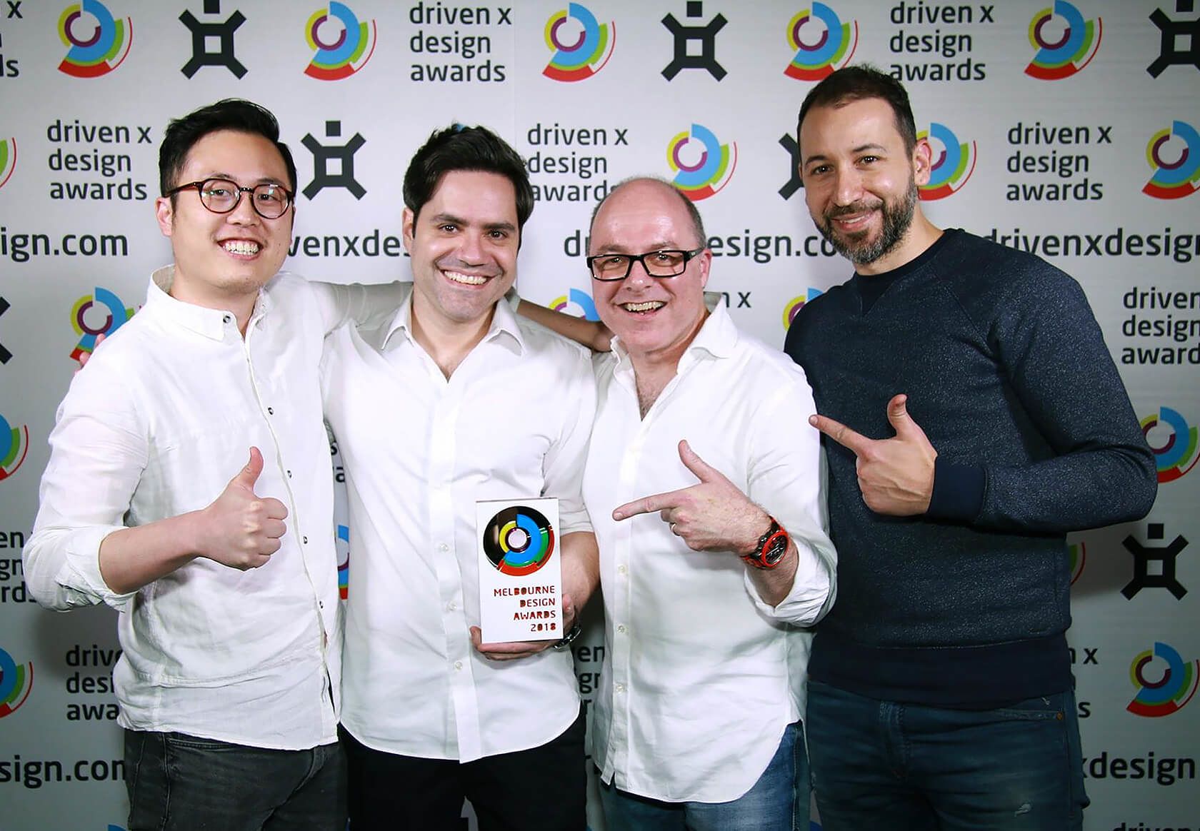
We had a great night at the recent Melbourne Design Awards, picking up an award in the ‘Corporate’ category for the FrancoCrea™ website. Above is a photo of us from the night wearing our best white shirts with Franco (the only person not wearing white), who deserves huge thanks for allowing us the creative freedom to produce some award-winning work.

Foxy lady
The new version of the Firefox browser is out, and with a focus on improved security and speed, The New York Times feels it’s serious competition to Chrome’s dominance.
The return of the fox
UX: the not so secret sauce of SEO
Google’s key criteria for ranking websites has been known for a while, however The Next Web do a great job of succinctly listing the Top 6 considerations, and they all revolve around User Experience.
See why Google thinks UX & SEO are a match made in heaven
Inspiration from the Grid
Our favourite creative post from Inspiration Grid in July is what Destin Sandlin spent years trying to recreate; the phenomenon of two vortex rings colliding with each other.
Go into the vortex…Think we might be a good fit for your project?
