Thanks!
We got your message and will be in touch as soon as possible.
Nice to meet you!
We'd love to hear more about you and your ideas.
The Latest

05 May 22
|
business
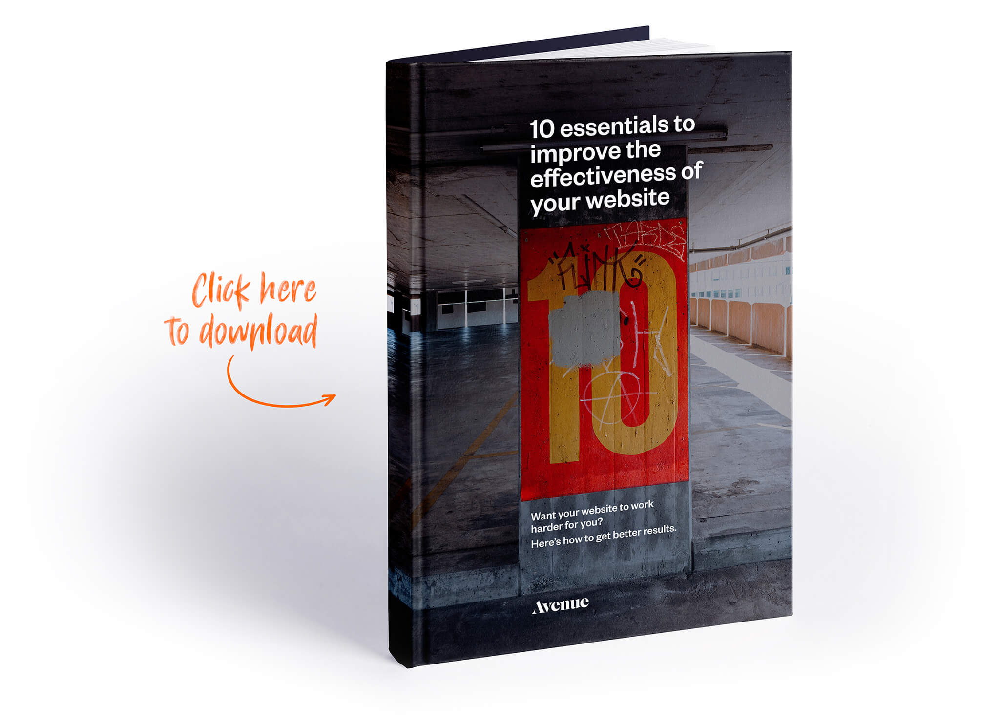
10 essential things to improve the effectiveness of your website
'Roundup' is the collection of key stuff we've either been reading, discussing or working on during the month at Avenue.
Want your website to work harder for you?
Here’s 10 areas you can focus on immediately to get better results and have a higher-performing website.

Now not everyone has the luxury of redesigning their website from scratch, so these are aspects you can apply to your current site just as much as developing something new.
Accordingly, these points ignore obvious aspects such as UX and UI design.
They are a given. These are points you can implement without a total redesign to get immediate results.
1. Follow a ‘content first’ philosophy
It doesn’t matter how good your website design is, if your content is poor, your site will struggle to be effective.
Content needs to be the first thing you do.
Organising what you need and want to say first will always allow you to have a better website design because it can then be focused on really powerfully presenting exactly what you need to communicate.
Your website design will always sing louder if it knows what it needs to say.
2. Map out your site structure
To map out an effective site structure, firstly list of all the pages you need, and then group them into sections and sub-sections.
Tip: Make the number of top level sections as few as possible, and then expand out through sub-sections, as this is more intuitive for people to understand.

3. Determine content hierarchy for key pages
Content hierarchy is the strategic ordering of information on a web page, where the most important information receives the most emphasis.
It’s imperative that this is considered to ensure you are presenting the most important information that your audience is looking for.
Defining the required content hierarchy on key web pages will go a long way to improving conversion rates.
4. Make sure your content has a purpose
The reality is that very few people are going to read every page on your website.
A potential customer may only view one, single page. So you need to make every page count.
So always ask yourself…
“What value is this page providing my target audience?”
“How is it helping them understand how you can meet their needs?”
Also determine what actions you want users to take after viewing each page.
A potential customer may only view one, single page.
So you need to make every page count.
Always ask yourself..
“What value is this page providing my target audience?
5. Use a copywriter
Writing for the web is a specialist area.
If you can afford it, always work with an experienced web copy writer.
6. Consider the impact of SEO campaigns
If you are planning to run SEO campaigns, get the SEO firm involved in your content and design process from the beginning.
Leaving SEO until late in the process can cause issues around re-work and additional costs in relation to both design and content.
Remember that Marketing copy is not SEO copy – they are usually very different.
7. Effective Web Content Presentation
Having great, well planned content is not enough.
Web content needs to be presented so it’s engaging, otherwise people will leave your site.
Screens are not the same as printed publications, so the approach needs to be very different.
In most cases, people will only skim read your page, so break your content up using heading styles, block quotes, images and video.
And give visual hierarchy to to the key takeaways on each page.
8. Avoid header carousels
Header carousels, especially on homepages, are very common.
Unfortunately though they are one of the worst things you can have on your website.
Why? There’s two key reasons.

Firstly, no one is looking at them.
The research is clear; the conversion rate for people both viewing and interacting with slides is virtually non existent.
Secondly, they can slow down the load speed of your web page considerably.
This is due to the coding scripts and large images they add to the web page.
So avoid using them at all times.
If the information is important, it needs to be seen without any delay or barrier.
Don’t hide it.
9. Importance of Page Speed
Page load speed is now the #1 website consideration.
The research is clear.
Slow = less engagement
Slow = less conversions
Slow = less customers
The best way to get a fast website is to build it properly with speed in mind.
But if you’re working with an existing site and can’t recode it, there’s three quick wins you can look to implement:
1. Size and optimise images properly
Don’t upload massive image file sizes. Work out the proper size images need to be on your site, and size them accordingly.
Always use an image optimisation tool, such as TinyPNG to optimise the images before you upload them to your website.
This can have a massive impact in reducing image file size without affecting quality.
2. Avoid the use of plugins
Plugins are very common and popular on web platforms such as WordPress and Shopify.
Unfortunately though, these can very easily bloat websites, dramatically impacting page speed.
So you should only use absolutely essential plugins. If it is not 100% essential, uninstall it.
3. Avoid all scripts that aren’t 100% essential
Any script you add to your website can slow the site down, as it is more code that needs to be read and actioned by the browser.
So the more you add, the slower your site will be.
Now some scripts are really valuable and important, such as Google Analytics. But even Google scripts can affect page load performance, so only install the tracking scripts you absolutely need and use.
10. Continual Improvement philosophy
One of the most important things to appreciate is that your website is never finished.
It needs to be in a state of constant evolution and refinement.
The best way to effectively evolve and refine your website so it performs better, is to understand how people actually use it.
So install Google Analytics and spend the time reviewing the data and analysing what it actually means.
You can also take this a step further and install heat map tracking to your site to understand deeper insights in how people are using your site.
So follow a process of:
- Reviewing
- Analysing
- Refining
- Repeating
as this allows you to make informed decisions on how to best refine your site to make it more effective.
